Events Diary: Building the Home Page
A page is built up by adding controls to it which are then configured for functionality and styling. You configure a control by selecting it and making changes to its Properties. When you add a control to the page, you can rename it to be more meaningful and easier to identify, or leave the system-generated default name. For help, see Introduction to Controls.
Tip When you start to add content to the wep app pages, it's a good idea to save the page regularly. You can also make duplicate copies of the page at key stages to act as backups—see the Page section in Configuring a Web Application Version.
Adding the controls
- Select and edit the Home page you created. For help, see Page Designer.
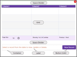
- From the Layout section of the Control toolbox, drag and drop a Space Divider onto the top of the page.
- From the Component section of the toolbox, drag and drop a Grid onto the page, below the Space Divider.
- Drag and drop a second Space Divider onto the page, below the Grid.
- From the Layout section of the toolbox, drag and drop a Container onto the page below the Space Divider.
- From the Common section of the toolbox, drag and drop a Label into the first Container column.
- From the Common section of the toolbox, drag and drop a Button into the second Container column.
Configuring the Grid properties
For help, see Grid Control.
Appearance properties
The example shown in this tutorial has font and colour changes made to the default Grid background, Alternate Back Color, Header, Footer, and Row properties. You can change these to suit your own style.
Data properties
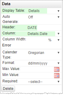
The grid must be bound to the data object Details by selecting it from the Display Table drop-down list.
Four grid columns need to be configured and bound to their corresponding fields in the data object. The screenshot below shows the Grid data binding, and the configuration of the first column, DATE.

The remaining three columns are configured with these Header and Column properties—other values are left at default.
Click Add to add extra columns.


Behaviour properties
When a user clicks an entry in the grid, the browser is redirected to the Manage page which displays the selected item for viewing, editing or deletion. You set the Redirect URL and Internal URL properties as shown below.

In Behaviour properties there are additional options to display a Search box, filter by column value, reorder columns, define page parameters, and so on, which are not used in this example. For details, see Grid Control.
Configuring the Container and contents
Configuring the Container
For help, see Container Control.
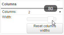
By default, a container comprises two columns split 50/50%. In our example, the first column holds a Label control with some user information. The second column holds a button to redirect to the Manage page. For appearance, an 80/20% split looks better.
Select the container, and in Appearance properties, drag the column width slider right to 80%.

Configuring the Label
Select the label, and in Data properties, type the user information, "Select a record from the table to View, Update or Delete." into the Default Value field.
Configuring the Button
Style the button as you want using the Appearance properties and change the Text field to "New Record".
In Behaviour properties you define the button type and action. Select Button Type:Link and Redirect:Manage.

Testing
If you have manually added records to the data object, you can test the Home page using the Design Preview button. The grid should display records from the data object.
